
People decide fast. In about 50 milliseconds, they form a first impression of your site, and if your copy does not answer “Is this for me?” right away, they leave.
Here’s the short version: I make website copy work by doing four things first:
This article says the same thing from start to finish: vague copy gets ignored, but copy that feels personal, plain, and direct keeps people reading. It also shows where to put proof, how to write buttons people want to click, and how to test whether a stranger can understand the page in 10 seconds.
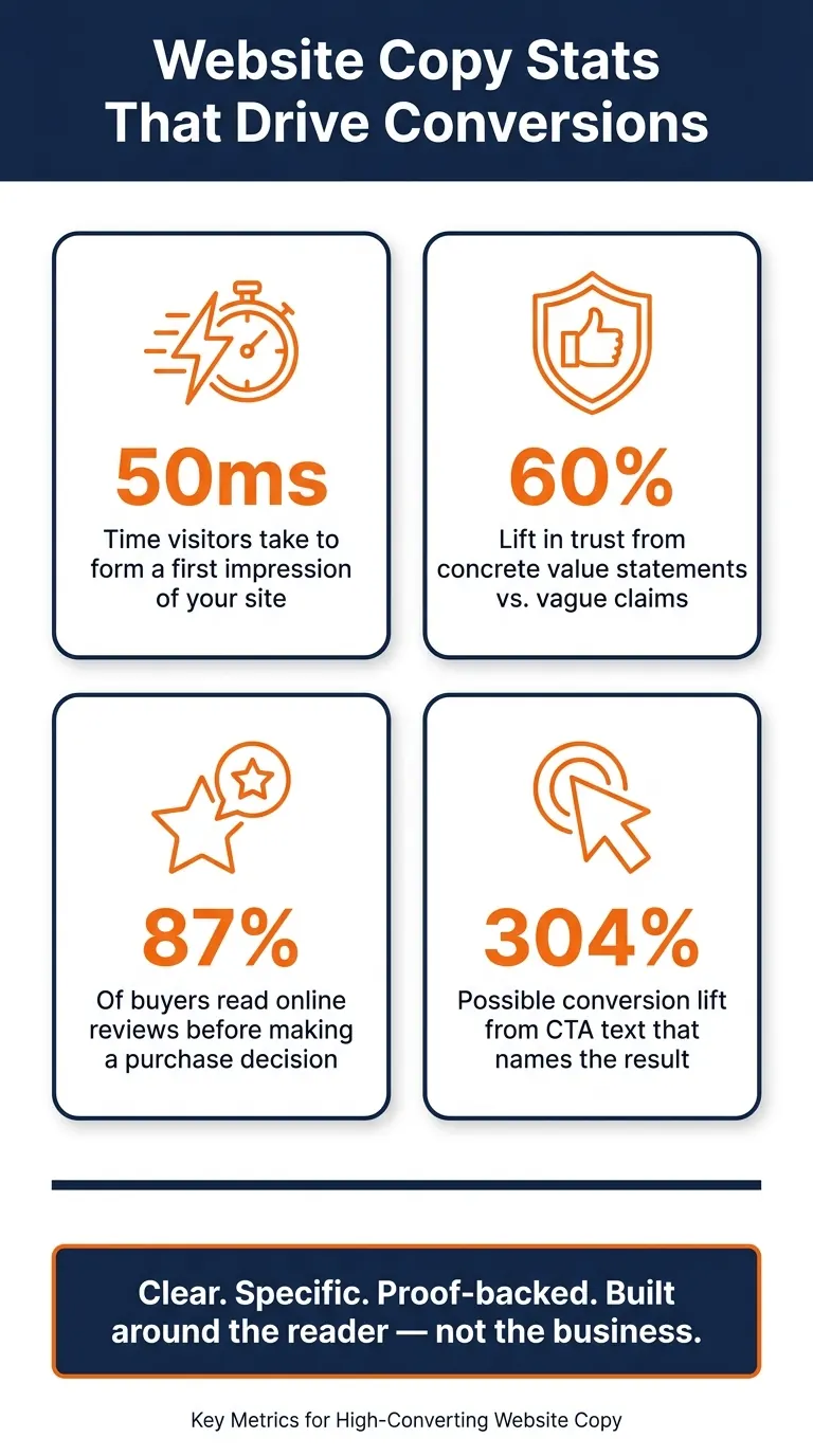
A few numbers stand out:
- : time it takes people to form a first impression
- : lift in trust from concrete value statements vs. vague claims
- : share of buyers who read online reviews before buying
- : possible lift from CTA text that names the result
If I had to sum it up in one line, it would be this: good website copy is clear, specific, proof-backed, and built around the reader - not the business.
How To Write Website Copy That Converts (and ISN'T Boring)
Start With Customer-First Positioning
Customer-first positioning flips the usual order. Start with the reader’s situation, problem, and goal, not what the company wants to talk about. Once the reader can see themselves in the copy, your next job is to make the value plain and specific.
Name the Reader, the Problem, and the Desired Outcome
Before you write a single line, get clear on three things: who the page is for, their main obstacle, and what they want to achieve. Those three inputs shape the copy. They guide your homepage headline, service description, and CTA line.
Write to one specific person, not a big, blurry audience. “Small business owners” is too broad. “Freelance designers who can’t get clients to take their pricing seriously” gives you something you can work with. The tighter the focus, the more the copy feels like it was written for the reader, not at them.
When you name the problem, use the same words your ideal client uses when they’re annoyed or stuck. Think about how they’d vent to a friend: “I keep posting on social media but nothing converts” or “I’ve redone my website twice and I’m still not getting inquiries.” That kind of wording hits harder than polished marketing talk because it sounds like real life.
Replace Broad Claims With a Clear Position
Once you know who you’re writing for, explain what you do in plain English. Skip the jargon. Skip the fuzzy promises too.
A simple formula works well here: “I help [who you help] [what you help them do or become].” In one sentence, that tells the reader who it’s for, what it does, and why they should care. The point isn’t to sound clever. The point is to be clear.
That gives you the base you need for the next step: turning broad promises into concrete benefits.
If a stranger can’t name your offer and audience in 10 seconds, rewrite the position before moving on.
Make the Value Clear and Specific
Now turn that positioning into value the reader can see and measure.
Turn Vague Promises Into Concrete Benefits
Make the benefit concrete. "Automate repetitive tasks and save 10+ hours a week" says a lot more than "innovative solutions." "Reduce project delivery times by 20%" gives the reader something they can picture. When the outcome is specific, the value clicks fast. The goal is simple: make the reader think, "That sounds like what I need."
If a reader can't explain your offer in 10 seconds, the hero section isn't doing its job.
Once the value is specific, carry it through the whole page.
Cut Jargon, Filler, and Passive Voice
Even a clear offer can fall flat if the wording is padded. Phrases like "cutting-edge", "end-to-end", and "empower" sound polished, but they don't say much. The same goes for filler lines like "Welcome to [Business Name]" or "We help you solve X faster." Passive voice weakens the message too: "Results are delivered" lands softer than "We deliver results." Plain, active copy is easier to scan and more likely to convert.
Here’s how weak copy compares with stronger replacements:
| Weak Copy | Stronger Alternative |
|---|---|
| "High-quality service" | "Emergency response in 59 minutes or less" |
| "Innovative solutions" | "Automate tasks and save 10+ hours a week" |
| "Dramatically improve efficiency" | "Cut report generation time from 3 hours to 15 minutes" |
Use words that explain the offer or push the reader toward action.
That same clarity should show up in the headline, service copy, and calls to action next.
Write the Core Website Sections That Hold Attention
Now that the message is clear, put it into the parts of the page that keep people reading. Good positioning and specific benefits don't do much if the page loses attention halfway through. Each section needs one clear job. And the copy has to do that job fast.
Write a Homepage Headline and Subhead That Explain the Offer Fast
Visitors decide whether to stay or leave within seconds. That tiny window is where your headline has to work hard. Its job is simple: answer the reader's first question right away: "Am I in the right place?"
A simple headline formula can help: "[Outcome] for [Audience] without [Pain]". It works because people can scan it in a split second. For example, "Tax filing for freelancers without the spreadsheet panic" tells the reader what they get, who it's for, and what headache they avoid - all in one line.
The subhead fills in what the headline can't. Use it to add the detail that helps the reader settle in: who the service is for, how it works, or a specific result tied to a timeframe. Put the two together, and the reader can get the point in seconds.
Once the hero section makes the fit clear, the next section should show that you understand the problem.
Use Problem-to-Solution Sections to Keep Readers Moving
After the hero section sets the stage, the next section needs to make the reader feel seen. A simple problem-to-solution structure works well here: name the problem, show the cost of leaving it alone, then present the fix. Use the same words the reader would use before you bring in your answer. That's the moment when someone thinks, "They get it." And that's often what keeps them on the page.
When you name the problem, don't stop at the symptom. Show what it costs in time, stress, missed leads, or messy work. Then bring in the solution as a change in their day-to-day life, not just a stack of features. The point isn't to list what your service includes. The point is to show what work feels like after the problem is gone.
Once the reader feels understood, move straight into the service that fixes it.
Describe Services and Process in Plain Language
At this stage, the copy should move from pain to proof that the next step is simple. A clean feature-why-it-matters-result structure helps here: say what the service includes, explain why that approach works better, then land on the concrete result the client gets.
A good service section should make the next step feel clear, not heavy. Keep it simple:
- A clear service name
- A short description focused on the benefit
- One obvious next step
Then break the process into 3 short steps. Keep each step to one sentence. Focus on what the client experiences at each stage, so the path feels easy to follow instead of full of guesswork. People don't want to piece the process together on their own. They want to see the path and know where to click next.
Add Proof, Write Strong Calls to Action, and Wrap Up
Place Proof Where It Supports the Decision
Once the process feels clear, the next hurdle is trust.
Put proof where people pause: near pricing, beside bold claims, or right before the CTA. That’s usually where doubt kicks in. So that’s where proof should do its work.
The best proof points to a real result. Add a name and photo, and it turns into something a reader can judge for themselves. One case study found that changing the page to fit how people scan, along with adding specific social proof, increased conversions by 61%.
And this matters more than ever. 87% of consumers read online reviews before making a purchase decision. In plain English, most people landing on your page are already hunting for a reason to trust you. Give them that reason right where they need it, and tie it to the question already running through their mind: "Will this work for me?"
Write Calls to Action That Feel Clear and Easy to Click
Once proof lowers doubt, the CTA should make the next step feel simple.
A CTA is the moment where someone decides whether to move or leave. Generic button copy like "Submit" or "Contact Us" feels flat. It reads like admin work. Specific text like "Book a strategy session" or "Request copywriting help" tells the reader what happens next. That kind of clarity makes clicking feel easier.
Here’s how a small wording shift can change the feel of a CTA:
| Vague CTA | Specific CTA | Why It Works |
|---|---|---|
| Submit | Get my free audit | Names the deliverable and creates ownership |
| Contact Us | Book a 30-minute strategy session | Defines the time commitment and outcome |
| Download Now | Get the guide in 2 mins | Highlights speed and low effort |
This isn’t just style. Using CTA copy that names the result instead of a generic button can lift conversions by as much as 304%.
A short line of micro-copy under the button can also help with last-second nerves. Something like "No credit card required" or "Setup takes 2 minutes" answers the small fear that stops the click. Place one CTA above the fold, one after proof, and one at the bottom of the page.
Conclusion: The Simplest Test for Copy That Makes People Care
Good website copy answers one question fast: "Is this for me?" Every part of the page - positioning, specificity, proof, and CTA - either answers that question or dodges it.
There’s a simple way to check. Show the page to someone who doesn’t know the business and give them 10 seconds. If they can’t explain what the business does, who it helps, and what to do next, the copy needs work. That’s the Stranger Test. It cuts through the writer’s blind spots and strips away what only seems obvious. If the page passes, it’s doing what it’s supposed to do.
Before any page goes live, run this quick check:
| Review Area | Question to Ask |
|---|---|
| Clarity | Can a stranger identify what you do in 10 seconds? |
| Readability | Is the copy written at a 5th–7th grade reading level? |
| Proof | Is proof placed next to or just before the CTA? |
| CTA | Does the button describe a specific outcome, not just an action? |
| Tone | Does the copy use "you" more than "we"? |
Flat website copy usually misses for the same few reasons. It talks about the business instead of the reader. It leans on vague promises instead of clear results. And it hides the next step under too much clutter. Fix those three issues, and the page starts doing its job: getting the right people to care enough to act.
FAQs
How do I know if my copy is too vague?
Your copy is probably too vague if it leans on fuzzy promises like “high-quality service” or “proven results” instead of plain, specific details.
Try the stranger test. Show your homepage to someone who knows nothing about your business for 10 seconds. Then ask them what you do, who it’s for, and why someone would hire you.
If they can’t answer, your message likely isn’t clear enough. The same goes if prospects often ask for clarification. That’s a sign your copy isn’t showing your value in a direct, easy-to-grasp way.
What should I fix first on my homepage?
Start with your hero section above the fold. That’s the first thing people see, so it does a lot of heavy lifting. A strong hero section can shape that first impression and help stop visitors from bouncing right away.
Focus on a few core pieces:
- A clear headline that says
,
, and - One specific call to action
- A brief proof point
- Fewer distractions that pull attention away from your main message
Think of it this way: if someone lands on your page and only reads that top section, they should still know what your business is about and what to do next.
How much proof does a landing page need?
A landing page needs enough proof to turn polite interest into real demand.
The strongest proof shows actual commitment, not just curiosity. That can look like:
- a booked call
- a pilot contract
- a refundable deposit
- a pre-order
As a benchmark, aim for a 25%+ main CTA conversion rate from 100–200 visitors, or a 1.5%+ paid-deposit conversion rate.
Real testimonials and early-user stories help too. They make the page feel grounded and give people a reason to trust what they're seeing.