
Most founder websites fail for one simple reason: they try to do too much.
If I want a site that gets more calls, trials, or sales, I need to keep it focused on one goal, use clear copy, show proof near the CTA, and track what people do after launch. A small site can work well with just a few pages, a plain-English offer, and one clear next step.
Here’s the short version:
- : booked calls, free trials, or purchases
- : who it’s for, the result, and why it matters
- : homepage, offer page, contact/booking, about, and maybe pricing
- : headline, support line, and one CTA above the fold
- : like
,
, or - : testimonials, client numbers, logos, founder photo, and process steps
- : mobile-friendly pages can drive
- : use tools like
,
, and
to see what needs work
If I had to boil it down even more, it would be this: say what I do fast, prove it fast, and make the next step easy.
How to build a website that (actually) converts
The smallest set of pages that can still convert
A small site can still convert well when each page has one clear job. No fluff. No mixed signals. Just a simple path that moves people from interest to action.
| Page | Primary Job |
|---|---|
| Homepage | State the offer fast |
| Offer page | Explain outcomes, process, and deliverables |
| Booking/Contact | Capture intent with one action |
| About | Build credibility through your story and experience |
| Pricing | Qualify leads before they reach your inbox |
Homepage, offer page, and booking page
Your homepage should give visitors the clearest version of the offer and point them to the next step. Someone should be able to land on the page and understand what you do, who it’s for, and what to do next in a single glance.
The offer page is where you explain the result, the process, and the deliverables. Talk about outcomes and value, not just features. Good copy here shows what clients get and how the process works, using benefit-focused language and clear visuals.
The booking or contact page should do one thing: make it easy for people to act. Use one short form or one booking link. Cut every extra field you can.
About and pricing pages that answer objections
The about page should explain who you are and why people should trust you. If someone clicks there, they’re probably already interested. They just want to know whether you’re the right person for the job.
The pricing page is optional, but it helps filter leads early. You can show a starting price, a range, or simple tier labels. If your pricing is fully custom, a short note about your tiers or project types can still help set expectations.
With those core pages in place, the homepage copy can do the clarity work.
How to write homepage copy that removes confusion fast
Once your core pages are in place, the homepage has to do the heaviest lifting. It needs to explain the offer in seconds, show why it matters, and point people toward ONE next step.
A simple site only converts when the homepage does three things well: it makes the offer clear, proves the value, and directs visitors to a single action.
Structure the hero section for immediate clarity
The hero section needs to work fast. Its job is to include a specific headline, a supporting subheadline, one primary CTA, and a simple visual that backs up the brand.
The headline should say what you do in plain English. Then the subheadline should answer two follow-up questions right away: who is this for and why should they care?
If a visitor has to stop and figure it out, you've already lost momentum.
Lead with outcomes, not features
A lot of founders talk about what they do. That's the wrong place to start. People care more about what they get.
So instead of listing features, lead with outcomes. That could mean saving 10+ hours per week or increasing revenue by 300%.
This shift can change how people respond to the page. Benefit-led copy helped Conscious Body Recovery rank #1 for "Contrast Therapy San Diego" and increase traffic by 400% in 3 months.
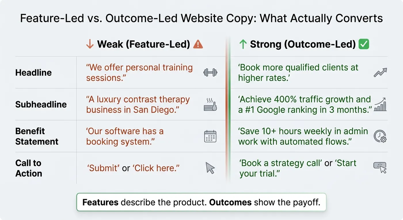
Here’s what that looks like in practice:
| Messaging Element | Weak (Feature-Led) | Strong (Outcome-Led) |
|---|---|---|
| Headline | "We offer personal training sessions." | "Book more qualified clients at higher rates." |
| Subheadline | "A luxury contrast therapy business in San Diego." | "Achieve 400% traffic growth and a #1 Google ranking in 3 months." |
| Benefit Statement | "Our software has a booking system." | "Save 10+ hours weekly in admin work with automated flows." |
| Call to Action | "Submit" or "Click here." | "Book a strategy call" or "Start your trial." |
The pattern is simple: features describe the product, while outcomes show the payoff.
Place calls to action where intent is highest
Don’t hide your CTA at the bottom of the page. Put it where people are most likely to act: in the hero, again after social proof, and once more near the bottom.
That way, visitors don’t have to hunt for the next step when they’re ready.
The button text matters too. Generic labels like "Submit" or "Click here" don’t say much. Specific action phrases like "Book a strategy call" or "Start your trial" make the next move feel clear and direct.
One more thing: keep that CTA wording the same across the homepage, offer page, and booking page. Mixed language creates friction. Consistent language makes the path feel obvious.
Once the copy is clear, trust signals and layout should do the next job.
Trust signals and layout choices that reduce friction
Once the offer is clear, trust becomes the next conversion test. Trust signals help people act because they answer one question fast: Can I trust this founder enough to book, buy, or sign up?
Place trust elements near decision points
Trust signals do their best work when they sit close to the moment someone is about to act.
So instead of burying a testimonial in a separate section three scrolls later, place a short client result right above or below your booking button. Specific proof like 375% sales growth beats vague praise every time. When a clear outcome sits next to a CTA, it cuts hesitation fast.
Here’s a quick reference for where each trust element belongs:
| Trust Element | Purpose | Best Placement |
|---|---|---|
| Client results with specific numbers | Remove objections | Adjacent to primary CTA |
| Short testimonials | Reduce hesitation | Below hero section or near pricing |
| Founder photo + one-line bio | Build credibility | Homepage mid-section |
| Client logos or press mentions | Instant authority | Above the fold or near the hero |
| Process transparency | Remove friction | Mid-page "How it works" section |
Showing the founder’s face and voice matters too. Even a simple photo with a short personal bio can make a clear difference for people deciding whether to book or buy.
After trust is visible, the layout has to make that trust easy to spot on every screen.
Design for fast scanning on desktop and mobile
Most visitors scan before they read. That means your layout needs to deliver the basics even if someone spends only 20 seconds on the page.
Use short sections, clear headings, plenty of white space, and a simple navigation bar. On mobile, clutter hurts conversions fast. A mobile-friendly layout can lead to 57% higher engagement, and Google’s mobile-first indexing means a slow or cramped mobile experience can also hurt search rankings. Use Google PageSpeed Insights to spot what’s slowing the site down, then fix it before it costs you conversions.
Above the fold on both desktop and mobile, the visitor should see three things right away:
- Your headline
- A supporting line
- A CTA button
Nothing should compete with those elements. Keep the visual hierarchy simple: one main heading, one supporting sentence, one button. Every extra element gives the visitor one more thing to think through before deciding to book, buy, or sign up.
A simple layout cuts hesitation and helps people act faster. Next, track where they stop and improve the page from real data.
How to launch, measure, and improve your site over time
Pick tools that support speed and iteration
Once the site is live, your job changes. You stop guessing and start watching what people do.
The best move here is simple: launch fast, then improve based on user behavior. You don't need a huge setup to do that. A lean founder stack can get the job done:
| Tool | Primary function | Typical use |
|---|---|---|
| Carrd | Simple landing pages (~$19/year) | Fast first launch |
| Framer | Flexible site builder | After validating your offer |
| Webflow | High-performance custom sites (~$20/month) | When you need more content and control |
| Calendly | Embedded booking flow | Any stage; reduces scheduling friction |
| Google Analytics | Traffic and conversion tracking | Install before launch |
| Hotjar | Heatmaps and session recordings | Post-launch iteration |
A Calendly booking link is one of those small changes that can make a big difference. It cuts down scheduling friction and gives people a direct path to book. Systems like this can save founders over 10 hours per week.
And that's the point of this stack. Each tool helps answer the same question: what should you fix next?
Track the numbers that show whether the site works
A site isn't doing its job just because it looks good. It has to move people to act.
Track the numbers that show whether that’s happening: conversion rate, CTA clicks, completed bookings, scroll depth, and clicks. Google Analytics shows traffic sources, page visits, and exits. Hotjar shows scroll depth, ignored sections, and friction points.
That gives you a clearer read on what’s working and what people skip right past.
If visitors drop off before they reach the booking button, the problem is usually the message, the layout, or both. Start with one change at a time. A new button color or sharper CTA copy is often a good first test.
Conclusion: Keep the site simple, clear, and measurable
Keep the site focused. Measure what matters. Then change ONLY what the data supports.
FAQs
How do I choose one conversion goal?
Choose one conversion goal that lines up with your main business growth target, like booking a call, starting a trial, or making a purchase. The key is to pick an action that shows measurable commitment, not just casual interest.
Then make that call to action clear and prominent across your site, so every visitor is pointed toward the same outcome.
What if I don’t have testimonials yet?
You can still build social proof before launch. Give early access to friends, peers, or influencers in exchange for honest feedback and testimonials. You can also post behind-the-scenes updates on LinkedIn or Instagram to show how things are going.
As your first users come in, focus on real stories. Run short interviews that bring out key moments and measurable results.
How soon should I update the site after launch?
Treat your first website like a digital billboard, not a finished product. Your business will probably change a lot in the early days, so start making updates as soon as it goes live. Use feedback, visitor behavior, and any performance issues to decide what to fix or improve.
Let analytics lead those updates. They can show you where people drop off, what gets attention, and what helps conversions. If you stay consistent, you give your site a better shot at building momentum over time.